


Tesco Garden & Outdoor Living: Digital // 2016
TESCO GARDEN & OUTDOOR LIVING
DIGITAL CONTENT
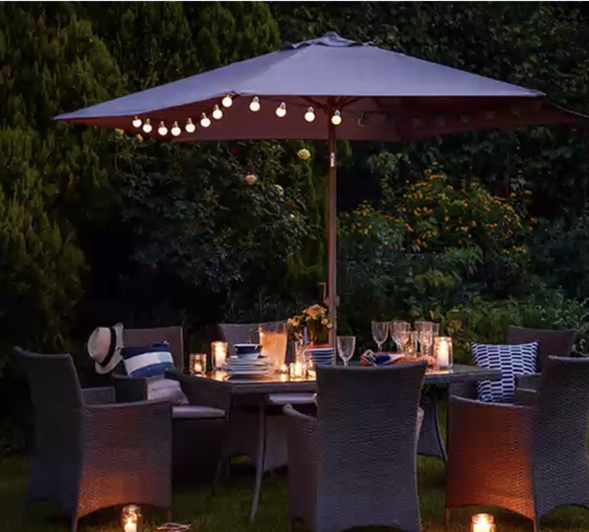
A selection of gifs and cinemagraphs created for social media use (Twitter, Facebook & Instagram)

Tesco Garden & Outdoor Living: Magazine // 2016




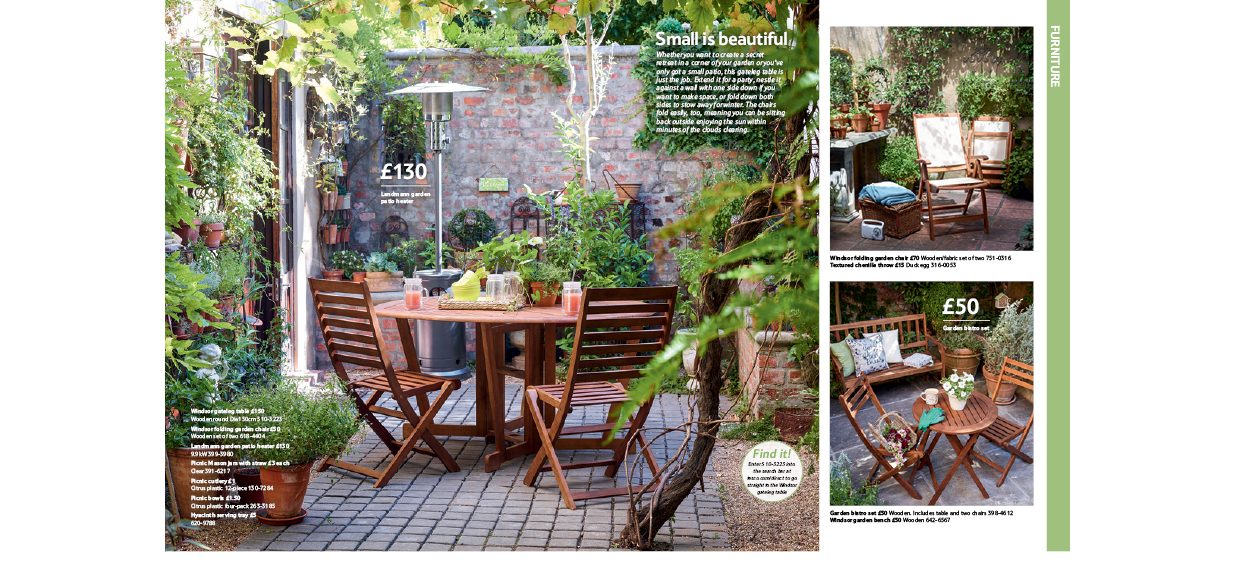


TESCO GARDEN & OUTDOOR LIVING MAGAZINE
EDITORIAL
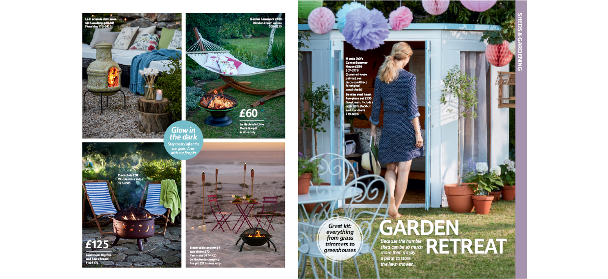
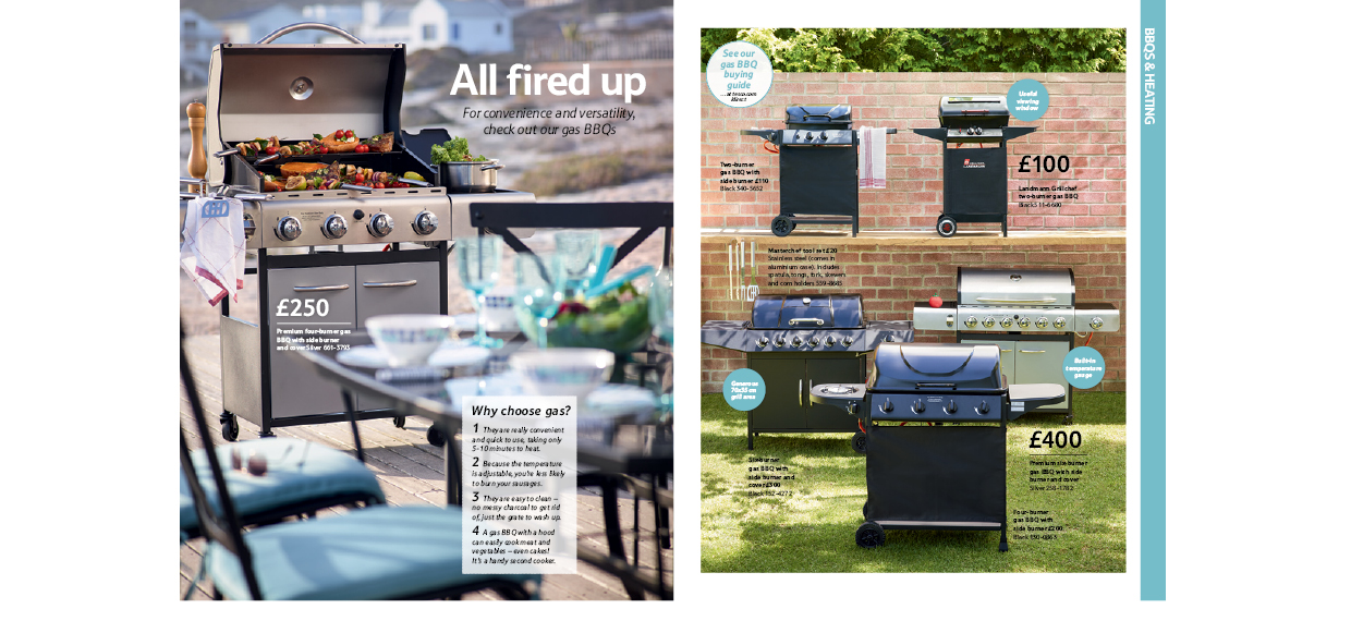
Working at Cedar, a content marketing agency in London, I was part of the design team
in producing Tesco Garden & Outdoor Living magazine. I was involved in the process from scamps to proofs;
designing pages, marking up for repro, retouching, colour-correcting proofs and liasing with production.
Tesco Home: Digital Content // 2016
TESCO HOME
DIGITAL CONTENT
A selection of gifs and cinemagraphs created for social media use (Twitter, Facebook & Instagram)

Tesco Home: Magazine // 2016


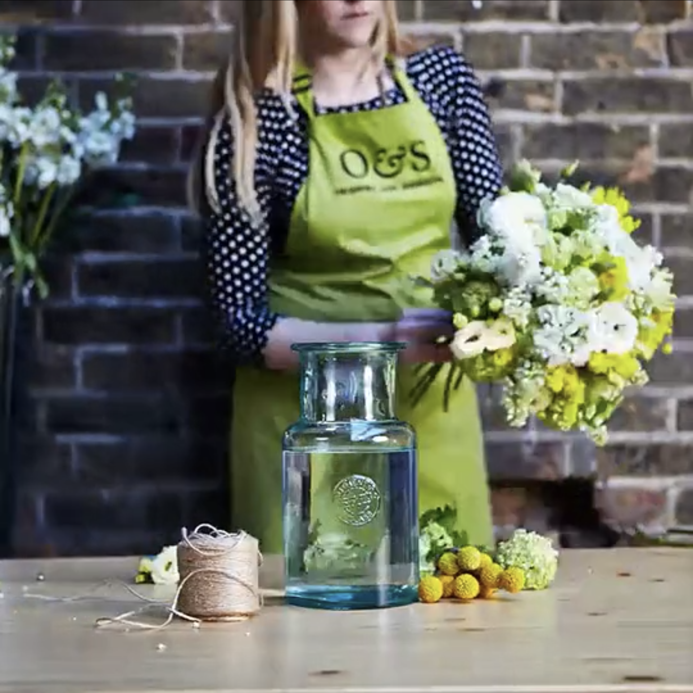
TESCO HOME MAGAZINE
EDITORIAL
Working at Cedar, a content marketing agency in London, I was part of the design team
in producing Tesco Home magazine. I was involved in the process from scamps to proofs;
attending shoots, designing pages, marking up for repro, retouching, colour-correcting
proofs and liasing with production.

Cornish Swim Academy // Brand Identity // 2016


CORNISH SWIM ACADEMY
BRANDING
Brief
To create a logo for Cornish Swim Academy, a swimming company based in Cornwall.
Solution
Proud of their Cornish heritage, I based the logo on the Cornish flag, and so kept a black & white finish.
I made the logo simple so it can be easily transferred to swim hats/clothing/signage, etc, as well as making it instantly recognisable as a swimming company, which was requested by the client.

Le Petit Prince // Brand Identity // 2015


LE PETIT PRINCE
BRAND IDENTITY
Brief
I was approached to design the identity for a new business; a patisserie in Bournemouth.
The business has since been a huge success; opening up a second shop in the area,
which they are currently in the process of expanding.
Solution
To differentiate this patisserie from competitors, myself and the owner agreed to give
the identity a simplified, contemporary edge, rather than the typical French style calligraphy.
The logo features a little P inside a larger P, embracing the name; ‘Le Petit Prince’.
The ownable crown provides a touch of detail and memorable element for the brand.

Airbnb // Degree project // 2015


KNOCK KNOCK
ADVERTISING CAMPAIGN
Brief
Create a campaign for Airbnb, empowering the existing community to grow this idea of
‘belonging’ out to a new audience. [D&AD New Blood Awards]
Solution
Playing on that initial moment of anticipation when knocking on someone’s door and anxiously waiting for the reveal. Whilst using the idea of a ‘knock knock’ joke to break the ice during that first encounter with someone, embracing Airbnb’s humorous, slightly sarcastic, tone of voice.
Using this joke format to share stories and engage potential new members to the community,
reiterated by a digital and physical knocker for the host’s door which is designed by themselves to represent their personality and their home, showing proudly they are a part of the Airbnb community and so emphasising this idea of belonging.

Epoch // Degree project // 2015


EPOCH
EDITORIAL & TYPOGRAPHY
Brief
Choose a person or subject, that has existed for a significant number of years
and produce a body of work that gives the user greater insight into your area of research.
[ISTD Student Awards: Milestones]
Solution
Learning about ancient mythology in how they collaborated over different epochs to save
humankind, in hope that their dedication inspires us in our mission to save our planet from
global issues such as climate change. Epochs refer to long periods of time, eras, milestones
in Earth’s history; key chapters in the story of our planet’s progression.
The title, ‘Melting Ice. Freezing Time’, refers to the ancients’ attempt to stop time, pursuing
through epochs such as ice ages, whilst we are currently trying to combat the ice melting and
rising sea levels in our mission to stop climate change. They aimed to stop time back to the
peak of the Golden Age, to stop any future cataclysms, such as a flood or an asteroid hitting
the Earth.
The ancients were reflecting the sky onto land by aligning their structures to the stars,
therefore a horizon line continues throughout the book, also acting as a timeline.
Rather than page numbers, a circular navigation tool marks the position in time by referring
to the ‘Great Year’ on the contents page, beginning from future to past.
A star is used as tittles, navigation and to direct the reader, and ligatures reflect collaboration.
The book would be received with a Sunday paper, as something for the family to discuss.
The time dial hopes to engage younger members, which works with the book, where aligning
to the correct stars reveals the correct date: 10,500BC. When held up to the light, it shines
through the dial and the constellations appear.
Written and designed by myself, content sourced from various books on the subject.