Brief To create a logo for Cornish Swim Academy, a swimming company based in Cornwall.
Solution Proud of their Cornish heritage, I based the logo on the Cornish flag, and so kept a black & white finish. I made the logo simple so it can be easily transferred to swim hats/clothing/signage, etc, as well as making it instantly recognisable as a swimming company, which was requested by the client.
Brief I was approached to design the identity for a new business; a patisserie in Bournemouth. The business has since been a huge success; opening up a second shop in the area, which they are currently in the process of expanding.
Solution To differentiate this patisserie from competitors, myself and the owner agreed to give the identity a simplified, contemporary edge, rather than the typical French style calligraphy. The logo features a little P inside a larger P, embracing the name; ‘Le Petit Prince’. The ownable crown provides a touch of detail and memorable element for the brand.
Brief Redesign a famous brand. [Design Bridge DB Student Awards] I felt that Golden Wonder should be brought back, repositioning the brand and giving it a purpose.
Once the number one crisp brand in Britain and now clinging onto survival, Golden Wonder has always struggled with brand positioning. Constantly changing their slogan and trying to find out what they stand for, it is for this reason it has been defeated amongst brands such as Walkers, who have strong, consistent brand values, not to mention the face of their brand; Gary Lineker.
Solution I repositioned Golden Wonder as the multi-flavour mystery brand, living up to its name and bringing about a moment of wonder to a lunch break. Amongst the overwhelming noise of different brands, colours and flavours; Golden Wonder owns that indecisive moment at the crisp isle. It combines all the flavours in one, eliminating the element of choice and leaving it up to fate.
The backwards question mark becomes the brand mark, emphasising that wonder and aspect of chance, while also acting as an assured stamp of that first initial: ‘G’. The star also becomes an ownable mark, recognisable as an explosive shape that has continued to be carried through the evolution of the brand.
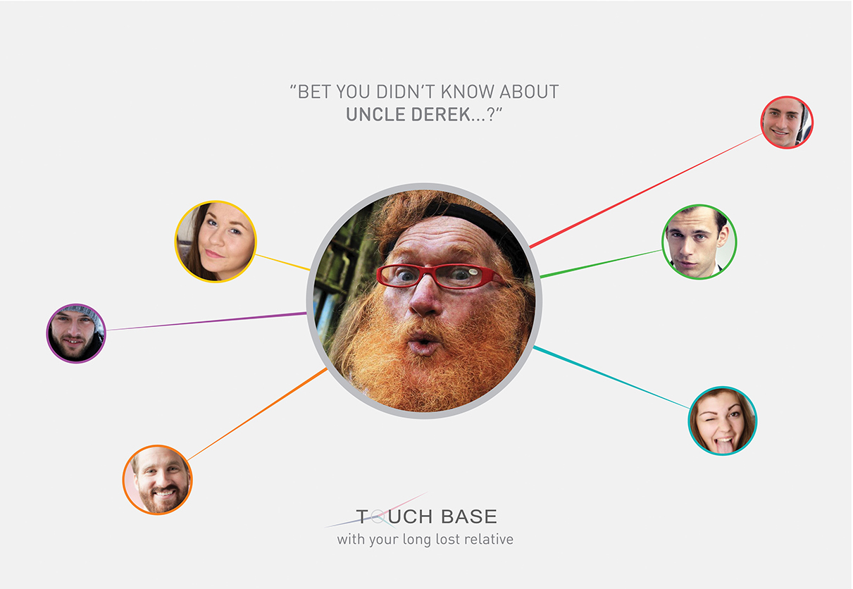
Brief Keeping families connected. A personal response to my experience of a family member moving abroad and our attempt as a family to keep in contact.
Solution Using perspective lines in art and photography, in changing perspective of family and online communication. Where family members, from all different places, come together and meet at a point. It is a visual family tree or network, offering a simple interface to ‘touch base’ with family members. Providing a secure digital environment for families to seek connections.
The outcome is an interactive, touch screen device. A product to attach on a communal wall in the home, such as the lounge or kitchen, and can be transferable to an app for communication on the go. It is a versatile service, adaptable to suit any type of family and can be personalised to emphasise your family identity, helping to bring you closer.
The visual makes it easy to see who you need to connect with more. As the longer the line, the more distant you’ve become with that family member. The shorter the line, the closer you are. It is also easy to see who is available, as their line will be lit up, and if they are not available they will be faded out. Touch Base visually and emotionally brings the family together.
Brief ‘Ultra Ever Dry’ is a new revolutionary product which is yet to be introduced into the market, its position and appropriate audience needs to be identified. The product itself is a super hydrophobic spray, repelling water and so keeping material dry, stain resistant and corrosion-free. It is currently an industrial only product.
Solution I decided to challenge the brief and completely transform the product. Currently a bland, scientific, unapproachable brand, I created a market for the product which turned these values into: feminine, warm and glamorous. I felt there was a gap in the market for a glamping product range, so this was an ideal opportunity to introduce this product.